"Color grading" sounds like a dark room full of monitors. On an iPhone it is one tap and a slider: you decide the mood of a photo, the warmth, the contrast, the way the colors lean, instead of leaving it to whatever the camera chose.
The mechanics take about ten seconds: import a look, tap it, move a slider. What separates a good grade from an obvious one is judgement. Which look suits the light you shot in, how far to push it, how to keep twenty photos looking like one set, and when to leave a photo alone. This guide is about those decisions. For the button pressing, see how to apply a .cube LUT to an iPhone photo, and for which app to press them in, the best LUT apps for iPhone photos.
What color grading actually is
Color grading is deciding the overall color and tone of an image on purpose. Correction fixes a photo: straighten it, set the exposure, neutralize a color cast. Grading gives it a feel: teal shadows and warm skin for a cinematic look, lifted blacks and muted greens for film, hard contrast for something bold.
The fastest way to grade consistently is not to nudge a dozen sliders on every photo. It is to apply a LUT or a preset, a saved recipe that moves all of those values at once, then dial it to taste. One tap, one slider, the same look every time.
The difference between correcting and grading matters more than it sounds, because it sets the order you work in.
Correct first, grade second
Every look you download was built by someone looking at a photo they had already corrected, so the shifts it applies are measured from neutral. Hand it a photo with a green fluorescent cast still in it and the look does not remove the cast, it adds its own color on top of one.
White balance matters most here, and it is the correction people leave until last. Get it neutral before the look, not after. If you shoot Apple ProRAW you have real room to move it, because the file holds far more color information than a finished HEIC. ProRAW capture needs an iPhone 12 Pro or a later Pro model, though any iPhone can edit a ProRAW file it receives. Setting the camera up to capture that room in the first place is its own short job, covered in the best iPhone camera settings for photos.
Exposure comes next, for the same reason: a look cannot put back detail that was never recorded. RAWCraft applies looks and sets their strength, and nothing else, so anything a photo genuinely needs correcting gets corrected first, in Apple Photos or whichever editor you already use.
Read the histogram before you pick a look
A histogram counts how many pixels sit at each brightness, dark on the left, bright on the right. Most editors show you one, and it tells you how much room a look has to work in.
- Piled against the right edge. Highlights are clipped to white, and a contrasty look only pushes more of the frame into that wall.
- Piled against the left edge. Shadows are solid black, so a film look that lifts blacks lifts noise rather than detail. The result reads muddy instead of faded.
- Spread out but short of both ends. What you want, and what a good ProRAW usually looks like. There is headroom for a look to move things into.
- Bunched in the middle. A flat capture. It will take a strong look happily, and usually needs one.
Match the look to the light, not the subject
A look does not know what is in your photo. It only moves the colors that are already there, so the same look lands completely differently depending on the light you shot under. Choose by the light first, then judge the result on your subject.
- Golden hour. Already warm, so a warm cinematic look adds warmth to warmth and tips the frame into orange. Golden hour usually wants something neutral or slightly cool, and lets the light supply the warmth itself.
- Overcast and blue hour. Flat, cool, low contrast. This is where warm looks and teal and orange grades earn their reputation, because there is a cast to push against rather than reinforce.
- Fluorescent and cheap LED. A green spike no look was designed to sit on top of. A warm look fights the green and everything turns a yellow, slightly sick tone. Neutralize the green first.
- Tungsten and night. Strongly orange, often several color temperatures in one frame. Skin is already ruddy, so cool looks turn it grey rather than neutral, and strong looks make the mismatch louder.
Before you audition anything, ask what the light already did to the colors. Half the looks in your library are answering a question this photo did not ask.
Grading for skin is not grading for landscape
Skin is the hardest thing to grade, because everyone looking at your photo already knows what skin should look like. It lives in a narrow band of oranges and reds, and almost every creative look touches that band on its way past. So judge a portrait on the face first and the rest of the frame second. If skin has gone ruddy, plastic, or grey, the look is wrong or too strong, and no amount of beautiful sky makes up for it. Film emulations push oranges hardest, which is why they need pulling back further on people than on anything else.
Landscapes are far more forgiving. Nobody carries an exact memory of those greens or that rock, so blues and greens tolerate a much stronger hand. When a person is standing in a landscape, the face wins.
How far to push it
Almost every grade that reads as overdone is a good look at the wrong strength.
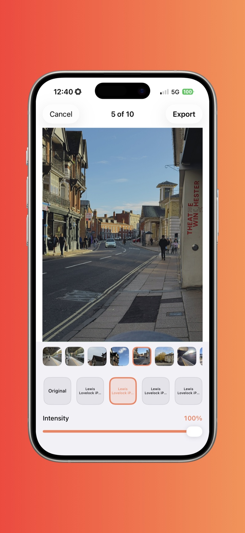
- Start around 60 to 80 percent. The intensity slider reduces how far the look moves the image. Most looks are built to be visible in a thumbnail rather than tasteful on a real photo, so full strength is the demo setting, not the answer.
- Judge at viewing size. Zoom out to the whole frame. A grade that looks barely there at full zoom is usually plenty at the size anyone will actually see.
- If it only works below 30 percent, it is the wrong look. Very low intensity means you picked something built for a different image, not that you found subtlety.
- Compare against the original once. Toggling back and forth destroys your judgement, because your eye adapts to whatever it saw last.
The target is a photo that looks like it was shot that way. If the first thing a viewer notices is the grade, the grade is too loud.
Keeping a whole set consistent
One look across a shoot is most of what makes a body of work look deliberate. The complication is that the light changed while you were shooting, so a set graded photo by photo drifts without you noticing.
- Sort by time before you grade. Shooting order makes the drift visible, which is the thing you are managing.
- Choose the look on a middle frame, not your favorite frame. Your best shot is usually your best shot because the light was exceptional on it, and a look tuned to that frame will not fit the other nineteen.
- Vary the intensity, not the look. When one frame is warmer than the rest, pull its intensity down rather than reaching for a different LUT. The same recipe at different strengths still reads as one set. Two recipes never do.
- Grade the set together, then review it as a grid. RAWCraft applies a look across a batch of up to 30 photos, and each photo keeps its own intensity afterwards, so you can adjust single frames without disturbing the rest.
If the light changed too much for one look to cover, split the shoot into two sets rather than forcing it. Two coherent halves look intentional. One inconsistent whole looks careless.
The common looks, and how to recognize them
Most of what gets sold as a look is a variation on four ideas.
- Cinematic, or teal and orange. Shadows pushed toward teal, midtones and skin left warm, contrast gentle. Spot it in the dark parts of the frame: a blue-green tint in the shadows while faces stay warm. It needs separation between subject and background, so it does little for a flat, evenly lit shot.
- Film. Blacks lifted so the darkest part of the image is not actually black, color muted, highlights rolling off softly, often with grain over the top. Recognize it by that lifted black point. It flatters imperfect light, which is why it suits street and travel work. See how to get a film look and add grain.
- Clean and punchy. More contrast and saturation with the hues left alone, so whites and greys stay neutral. Recognize it by the absence of a cast, and reach for it when color has to stay believable.
- Muted and matte. Saturation down across the board, contrast reduced, often slightly cool. Recognize it by the flatness. Good for moody weather and interiors, and it makes a sunny holiday photo look like a mistake.
When not to grade
- The photo is a record. A receipt, a whiteboard, a serial number. A look makes it harder to read and buys you nothing.
- The color has to be true. A buyer who receives a different green than your photo showed does not care which LUT you used.
- The light was already doing the work. Exceptional light needs less help than you think, and a strong look is the fastest way to flatten it.
- The real problem is not color. No grade rescues soft focus or a bad frame.
Quick answers
Can you color grade on an iPhone? Yes. With a look-based app you can grade to a professional standard on the phone, especially from ProRAW files, which hold enough color and dynamic range to take a strong grade without falling apart.
How do I colour grade photos on iPhone? Colour grading and color grading are the same thing, UK and US spelling. Correct the exposure and white balance first, then apply a look, a LUT or a preset, and set its strength so the mood reads without skin going orange. A ProRAW file has enough colour and dynamic range to take a strong grade. The sections above walk through each step.
What is the difference between editing and color grading? Editing corrects a photo, grading sets its mood and color on purpose. Correct first, grade second.
Do I need Lightroom or DaVinci Resolve? No. Lightroom Mobile is free to use with an Adobe account and applies .xmp presets on the phone perfectly well, but it does not apply .cube LUTs, so a library of .cube files needs an app that reads them. DaVinci Resolve is a desktop color tool built around video.
How many looks should I keep? Fewer than you think. Three to five looks whose behavior you know will serve you better than two hundred you audition from scratch every time.
Can a look fix a badly exposed photo? No. A look redistributes the color and tone already in the file, and clipped highlights have no detail left to redistribute. That is why correction comes first.
RAWCraft is a one-time $14.99 with 10 free exports, so you can grade your own shots before deciding, and apply your look straight to your ProRAW file without a desktop.